For a healthy tomorrow
Project Brief
HCLUB
We were tasked with building a lifestyle brand around health that felt powerful enough to promote the need for elderly care, while feeling completely natural at the same time. This led to the development of HClub, who’s core values were well rooted in healthand successfully communicated the need for elderly care in India. Each interaction with the brand invited people around the country to join them on the journey, and clients have been engaged, every step of the way.
Deliverables
- Website Front end
- User Dashboard and Portal Design
- Identity Design
- Branding Collaterals
- Profile Development
- Print and Publications
Logo Description
It is always important for a logo to be relevant with the kind of brand it represents and to immediately strike a chord with its consumers and audience. That’s why it was essential to in cooperate the core values of Hclub in its logo. A sea of blue letters that overflows one with a sense of serenity and calm with a tinge of pink. Our aim was to impart the belief that with the right mixture of compassion, nurturing and an abundance of calmness one can always remain healthy both today and tomorrow. And how could we refrain from using the ever-important element of health: a healthy heart.
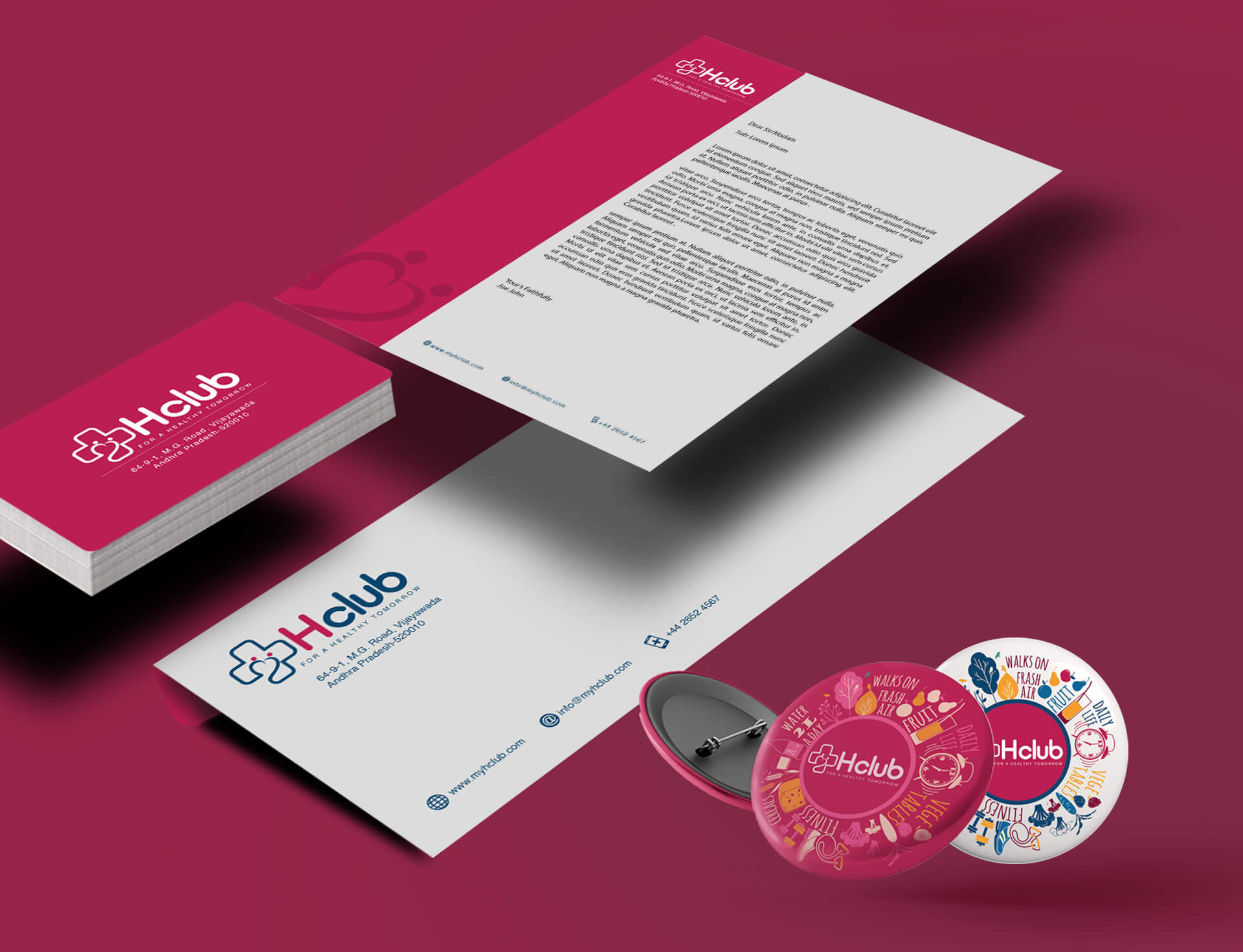
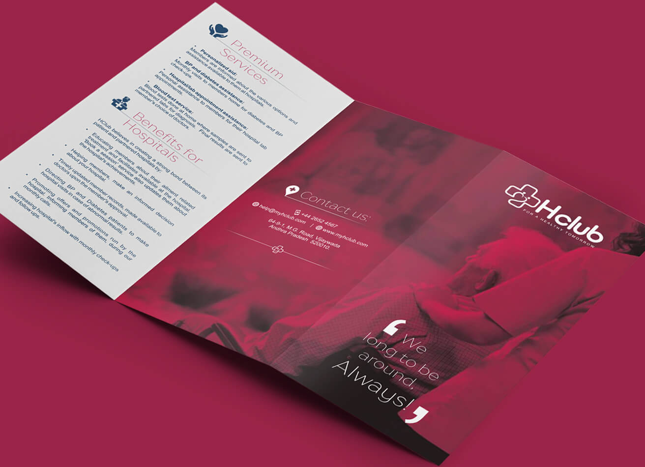
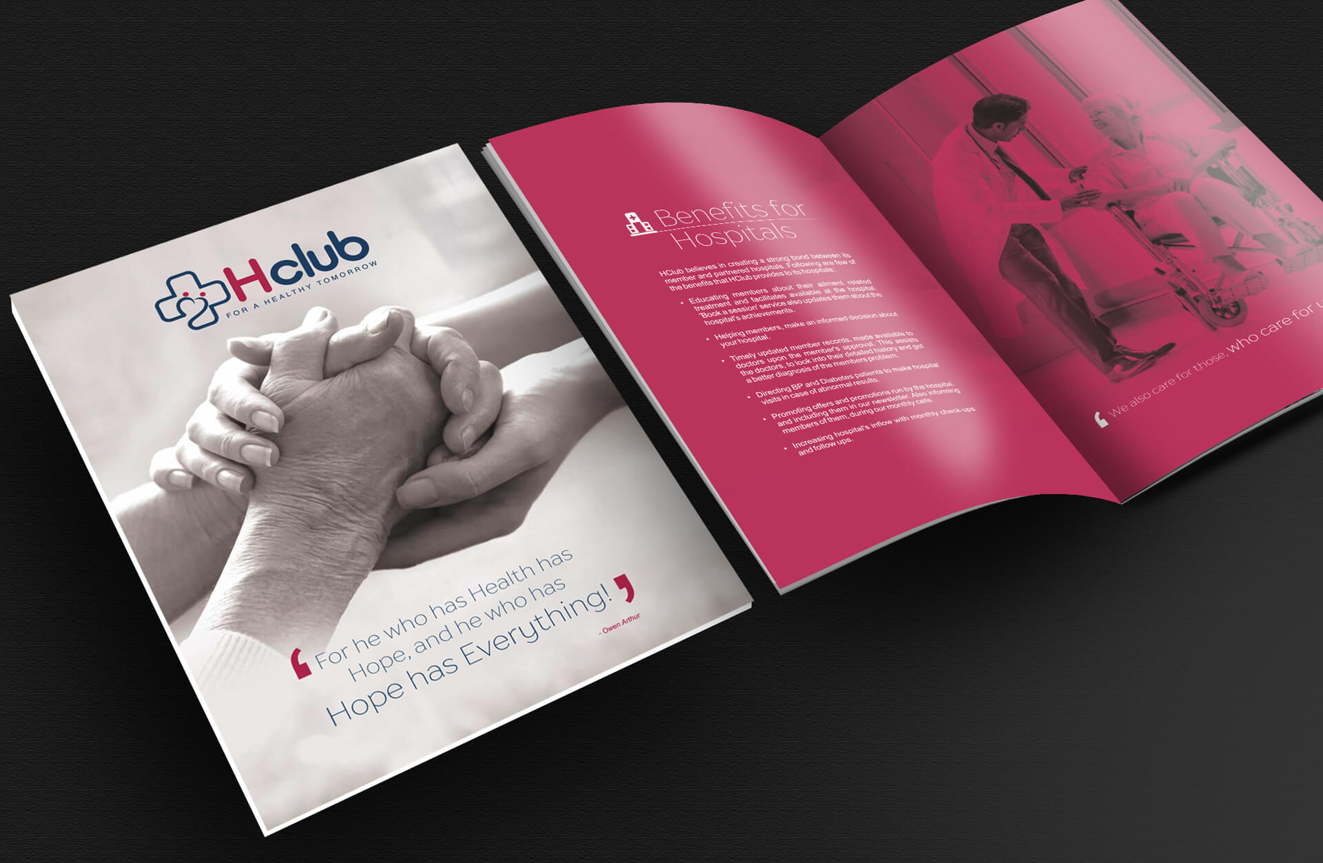
Brand Collaterals
We leveraged the emotions behind elderly care and gave it a fresh sensibility. We set out to build excitement and awareness in the health care segment by tapping in on the emotion quotient and by building around a traditionally sentimental space.
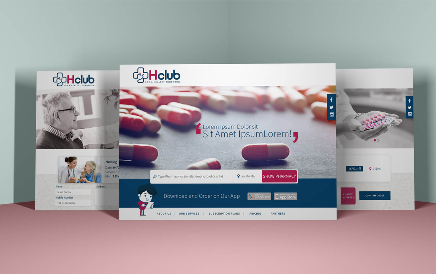
Portal Front End
We embraced the quirk of the existing brand by weaving a digital experience that was just the right balance of information and interaction for the user to comprehend. By establishing HClub as a guiding light to better elderly care, we made it possible for customers to forge deeper connections with the brand.
Front End UI
Keeping in mind the balance between information and interaction the user interface was given a much more humane touch. With less clutter and more visual ease of access. Services that were more commonly required were always place in front or within a click away. The UI was also designed while keeping in mind the section of elderly people that might access to it and convenience of use was our top priority.
Dashboard
Thanks to brilliant idea of the Hclub dashboard. This dashboard is a coming-of-age feature of the website. It was designed and curated accordingly to be a one stop solution for all queries and to provide patients with all kind of valuable information to track their progress to a healthy life.
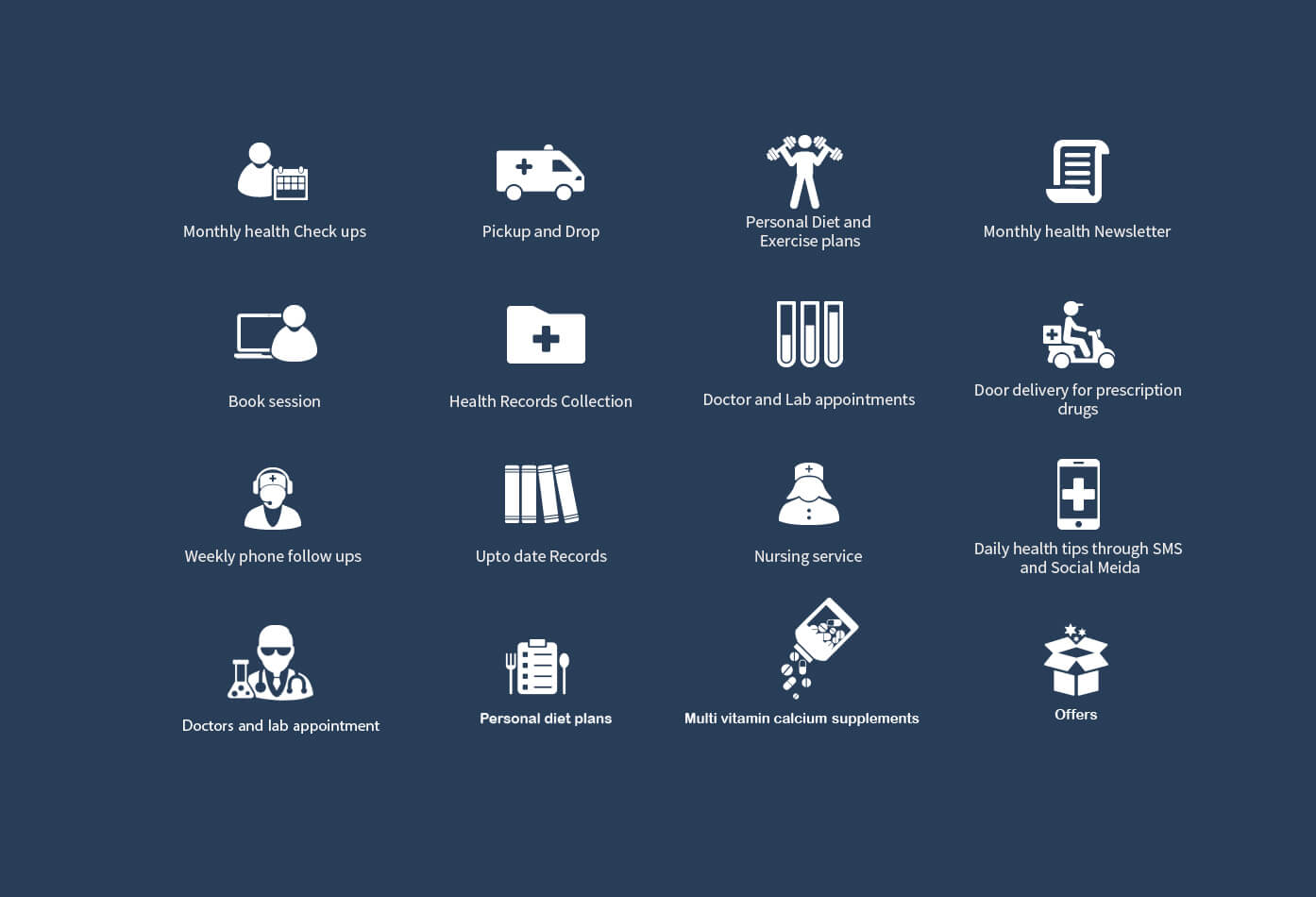
Iconography
Keeping in mind the common barriers of language and the advantage visuals bring over text an accurate description of each service was portrayed through respective icons. These icons were also placed within contrasting colors so that the visitor can easily identify which one to click on.